Making Publication-quality Charts using Python and Matplotlib
20 August 2014
Python is currently my programming language of choice. It is the programming language taught by my graduate program to incoming first years, and in my experience it is the most common scripting language used by the scientists around me.
Because of this, when I want to work with data my first instinct is to go to python. Python is very effective for importing data, doing all of the manipulations necessary, and performing statistical tests. Ultimately, while I am aware that there are a multitude of other tools available, I would rather stick with python.
In my experience, the most painful part of using python for data analysis is visualization. Plotting in python is primarily accomplished via Matplotlib. I find the syntax fairly straightforward, but the default output of the charts leave much to be desired. In particular, I find myself messing with the spacing between the labels and the graph, the size of the labels and title, the linewidth, the colors of the objects, and the visual appearance of the regular tickmarks all to make a single figure look appealing enough to share with my peers. Trying to do this consistently is even more maddening, as it ultimately results in even more boilerplate code.
I ultimately (mostly) solved this problem by creating a matplotlibrc file which automatically imports a number of settings for every chart I choose to work with. My matplotlibrc file lives in a github repository where you can freely grab and modify it. Just put it in your ~/.matplotlib/ folder. I also thought I would use this space to talk about the decisions I made in designing the matplotlibrc to get as close as possible to publication quality images with no special styles in the python code.
Matplotlib’s defaults are unsuitable for any professional purpose
The best way for me to show the problems with the defaults in matplotlib is to show the output of a small snippet of code:
import matplotlib
import matplotlib.pyplot as plt
data = [220,14.2,150,400,420]
error = [10, 1, 20, 60, 10]
x = [i + .5 for i in range(5)]
fig, ax = plt.subplots()
bar = ax.bar(x, data, 0.8, align="center", yerr=error)
plot = ax.plot(x, data)
ax.set_xticks(x)
ax.set_xticklabels(('wt', 'N23PP', 'N23PP/PEKN', 'PEKN', 'N23PP/PEKN/L28F'))
ax.set_title(r"Everything in the document can use m$\alpha$th language", y=1.05)
ax.set_ylabel(r"Rate (s$^{-1}$)", labelpad=10)
ax.set_xlabel("Mutant",labelpad=10)
ax.yaxis.set_ticks_position('left')
ax.xaxis.set_ticks_position('bottom')
plt.savefig('test.png')
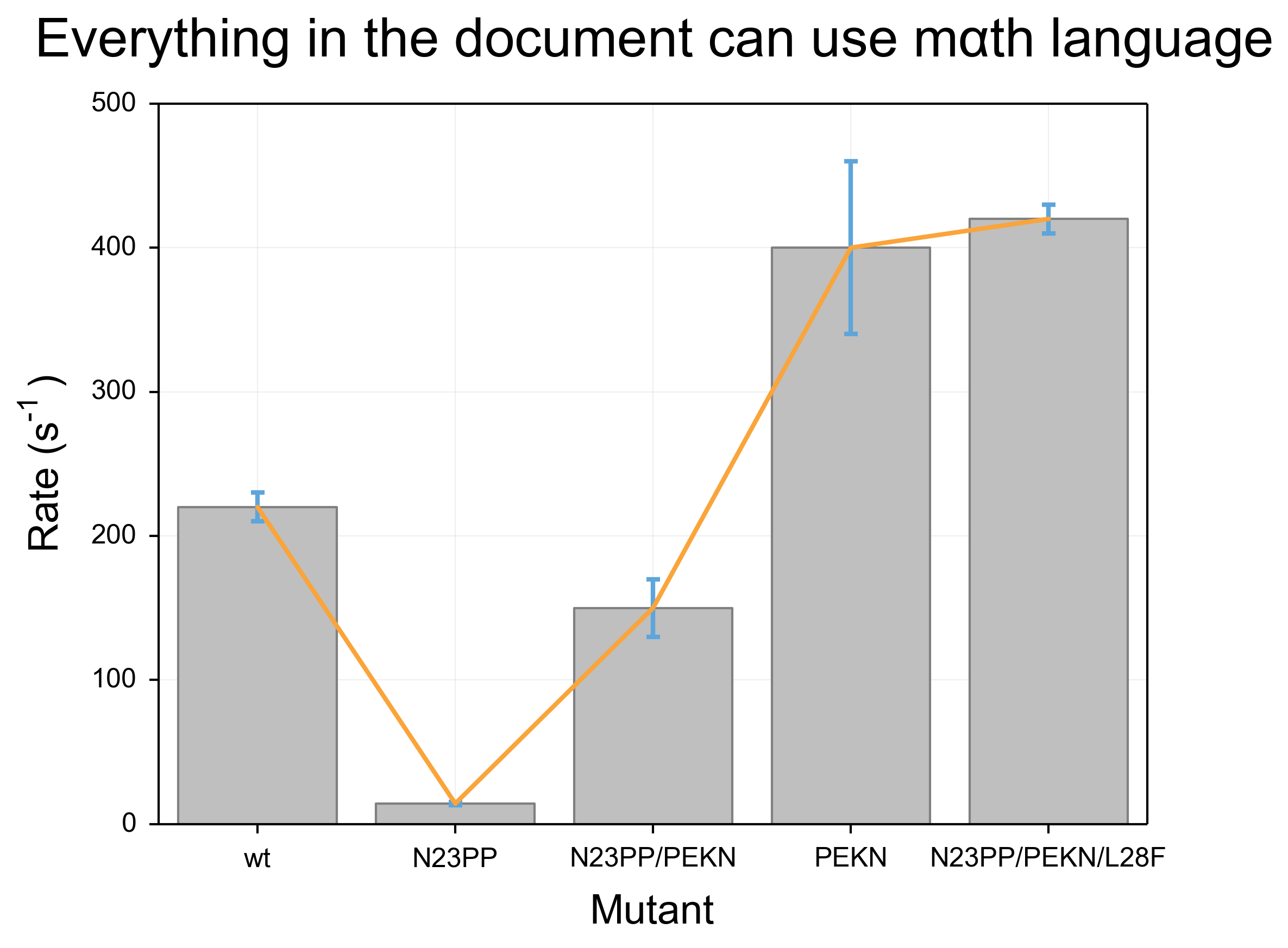
plt.show()In this code, I start with two lists, one of y values and one of error values, and proceed to make a named bar chart. I also throw a line graph on top for illustrative purposes and add some axis labels and a title. You’ll notice that I actually cheated and did a little bit of formatting in the code: I added padding between the title and axis labels and the graph, and I got rid of the tickmarks on the right and top sides of the graph. This is because these are not settings that can be affected by the matplotlibrc, so it is unavoidable to include them.
The results for this code are below. It is fraught with problems. Most obviously, the colors are unpleasant and more importantly unclear. Because the bar objects and the error bars are the same shade of blue, the lower half of the error bars become invisible. Furthermore, the line that is overlaid is narrow and a difficult shade of green that is particularly unpleasant when overlaid above the blue of the bars. The axis labels are also problematic. First, they are too small and as a result difficult to read. Further, the special formatting (such as use of greek letters and superscripts) uses a distinct font compared to the rest of the text, which makes the labels even more difficult to read.
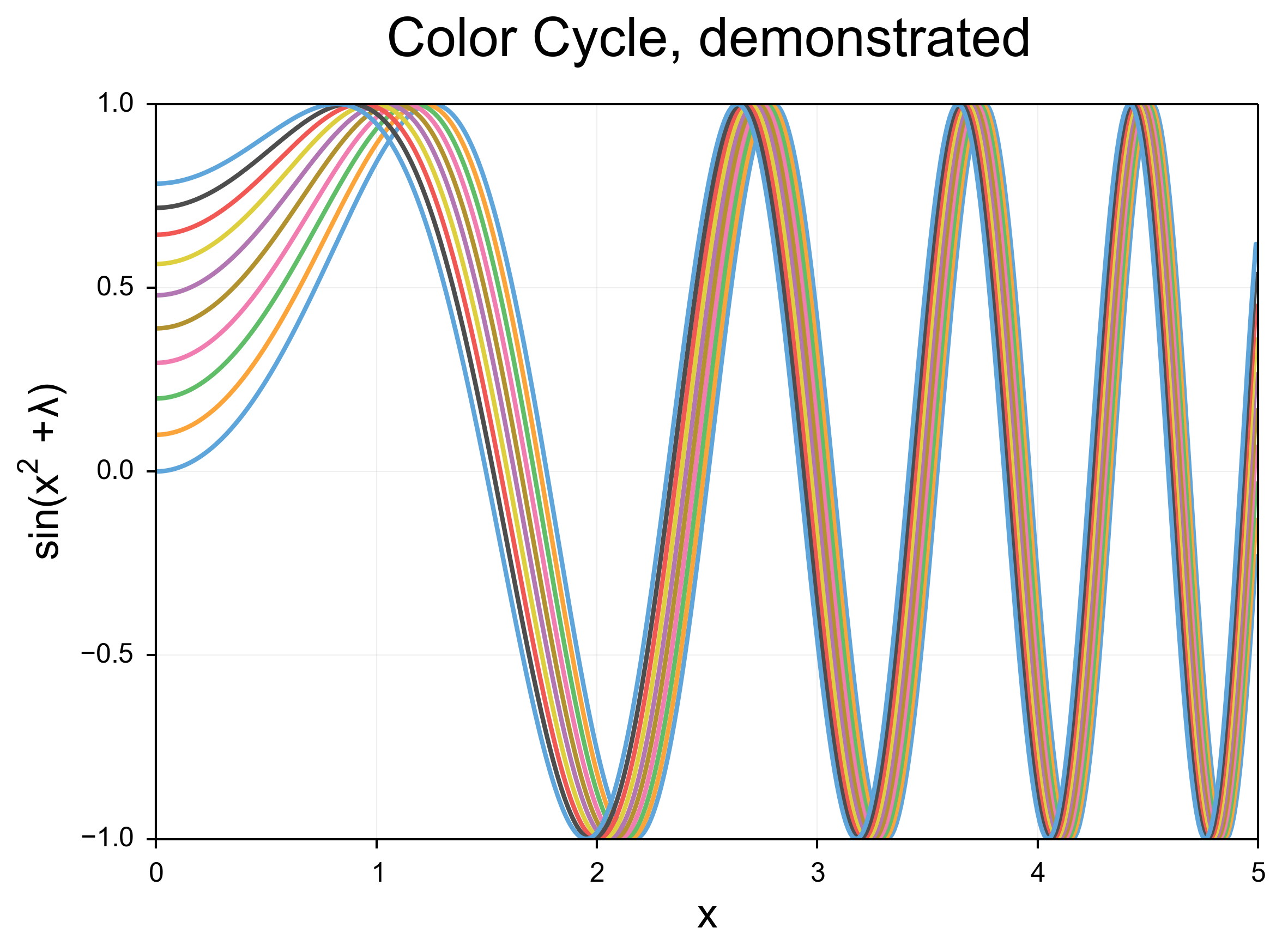
In order to highlight the ugliness of the default color cycle in python, I have attached a second, simpler piece of code and its output:
import numpy as np
import matplotlib
import matplotlib.pyplot as plt

x=np.arange(0,5,.01)
fig, ax = plt.subplots()
for i in range(10):
    y = [np.sin(datum**2+i/10.0) for datum in x]
    ax.plot(x, y)
ax.yaxis.set_ticks_position('left')
ax.xaxis.set_ticks_position('bottom')
ax.set_title("Color Cycle, demonstrated", y=1.05)
ax.set_ylabel(r"$sin(x^{2}+\lambda{})$", labelpad=5)
ax.set_xlabel(r"x", labelpad=5)
plt.savefig('test2.png')
This code draws a lot of lines which become closer and closer to each other.
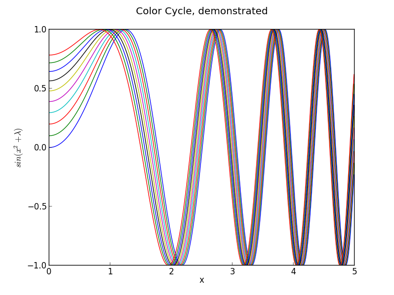
The linewidth problem is apparent here, but just as apparent is the inappropriateness of the high-contrast default colors.
Writing a matplotlibrc to fix things
Matplotlibrc files work by adding settings to a text file in the format option_name: option. I made changes to less noticeable things like the backend and the display size and resolution, as well as turning on the “autolayout” option that I find makes much better use of the available space, but in terms of the major problems I discussed above, I made changes in 5 main areas.
Lines
The first thing I did with the lines was to increase the linewidth, so that the lines have a nice weight. Additionally, I turned on anti-aliasing, and introduced rounding at the line edges. In addition to the changes in color detailed below, the effect is quite dramatic. These changes also apply to error bars, and the readability improvement for those is dramatic.
Colors
I introduced a new color cycle, taken from this blog, which in turn took it from Stephen Few’s book “Show Me The Numbers: Designing Tables and Graphs to Enlighten”. This color wheel applies to objects such as lines and error bars. It brings colors much closer to the pastel range, and they sit next to eachother well without creating bad contrast, while still being readily distinguishable. Combined with the improvements to the line shape, the effect is a much clearer, softer line compared to the narrow, harsh colored lines of the default settings.
Shapes
I gave the bars in barcharts and other such shapes a light grey color, which stands out while also allowing other objects such as error bars to be overlaid very clearly. I gave them a thicker, darker grey outline, which gave them a softer gradient than the default black outline. Overall, these objects play very well with the grid, line and error bar overlays, and overlaid text (not shown).
Text
I made significant changes in the font. I immediately increased the font size for the axis labels and the title, to 18 and 24 points respectively. With the increased DPI (discussed above) the effective font size is significantly larger. I also adjusted the font selection to be more math-friendly, so that I could accomplish my second goal: making sure that the mathtext (for things like superscripts) looks identical to the normal font. Right now, Arial is the first preference for fonts, followed by helvetica. Changing to a serif font in the script will continue to use math-friendly fonts. Overall, the text is much more consistent looking and much more clear. Math displayed in the arial font is not as pretty, in my honest opinion, as the defaults, but the continuity with the rest of the text is worth the sacrifice.
Grid and Tickmarks
I turned the tickmarks to face outwards instead of inwards. This has a few effects, including giving clearer marks in particular in busy areas of the graph, as well as placing more spacing between the tick labels and the chart itself. I also further added to the padding between the tickmarks and the tick labels. To extend the tickmarks inwards to the graph itself, I turned on the grid, gave it a very light gray color, and placed it behind all other objects drawn on the chart.
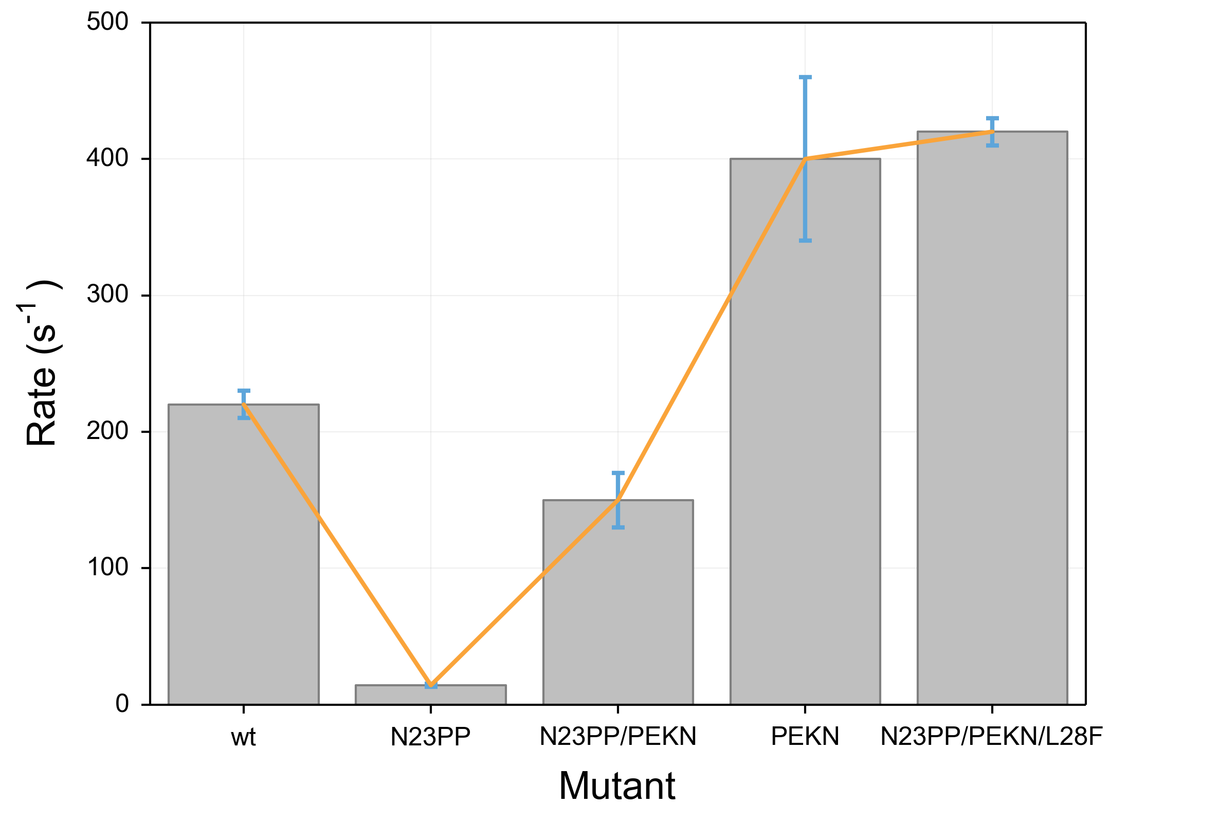
The results
These are the same scripts as above, run with the new matplotlibrc and no other changes. I am very happy with the output, although no doubt I will continue to tweak it as time goes on! I would appreciate feedback as always. Again, like I said above, you can find the matplotlibrc at my github page. Contributions are welcome there as well as in the comments.